
When we started building 250.gov, the first version had the familiar shape of a serious civic website: event pages, a Freedom Truck section, search, filters, timelines, and clean paths through a growing body of information—but we decided it wasn’t enough.
We wanted to explore what it would look like to add the first public-facing AI instance to a government website and see if it could meaningfully help users find and participate in events for America’s 250th, like The Great American State Fair in Washington, D.C.
The first thing we tried was an “Ask anything about this site” chatbot. This was the obvious move, and it worked: asking was a natural gateway into the site’s content. The problem was downstream. Once the system found something useful, it still returned it as prose, flattening structured content into a paragraph and making the user do the work of turning that answer back into action.
We stepped back and studied the most popular AI interfaces: ChatGPT, Gemini, Claude, Grok, and Google’s AI Mode. Most of them share the same basic contract: ask a question, get a text response. That makes sense for a general-purpose assistant. It made less sense for 250.gov, where the answer might be an event card, a truck route, a map, an image, or a resource someone could use directly.
We realized that there was fundamental information loss in returning a text response—the type of information we wanted to convey on the site was rich, multimedia, and sometimes tied to a date/time—things that are hard to visualize in a wall of text.
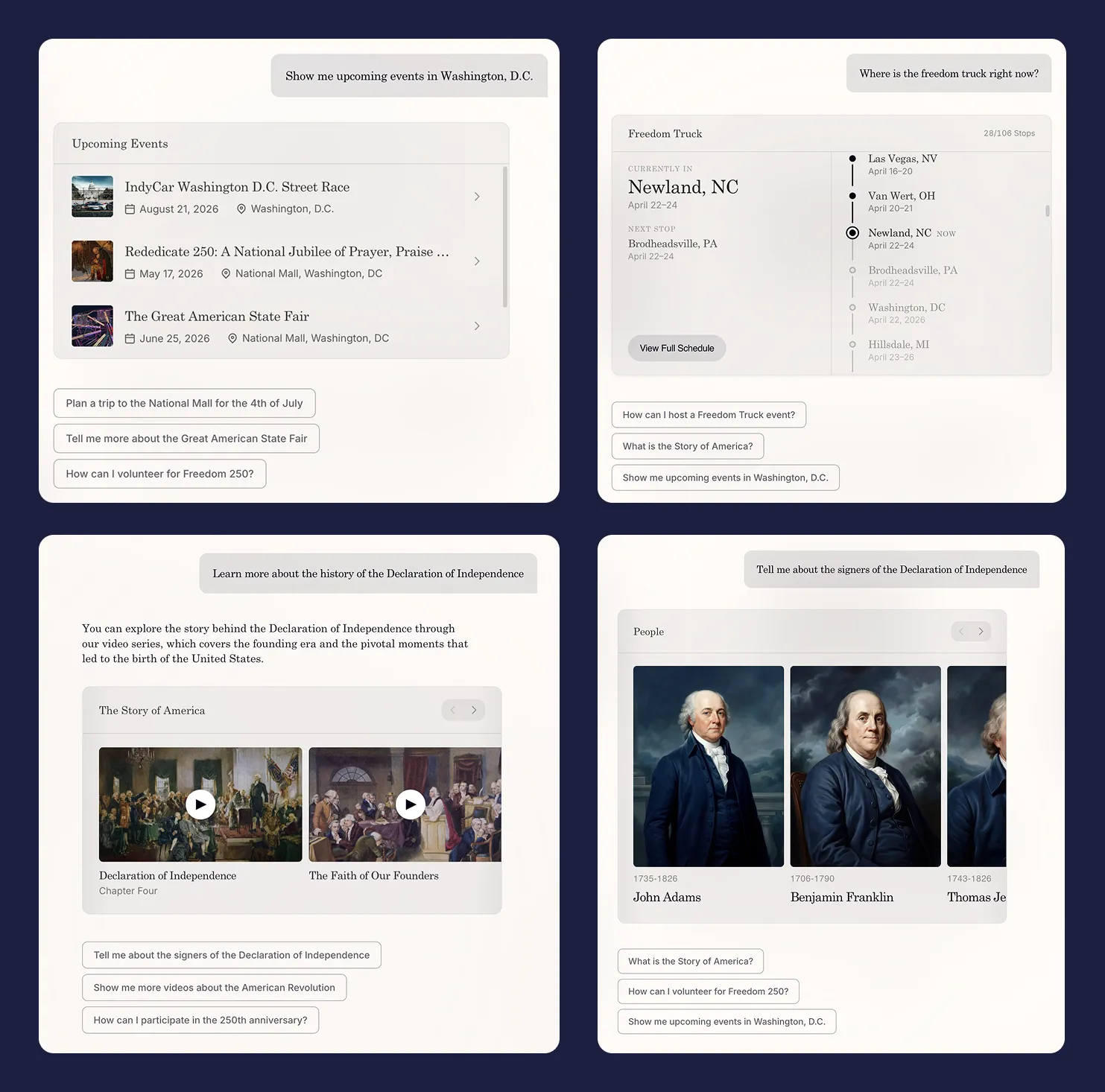
So we made what now seems like the obvious move but didn’t at the time: we stopped treating the model as something that returns sentences and started treating it as something that returns interface. Ask about events, get event cards. Ask about the truck, get a timeline. Ask about a trip, get an itinerary. The model’s job stopped being writing and started curating.
This sounds small. It isn’t. Once the answer is a piece of UI rather than a piece of text, the whole site reorganizes around questions instead of pages.
Three iterations to get the interaction right
We first tried putting the chat in a sidebar: site on the left, conversation on the right. We thought this was correct at the time, because it’s how every other AI-augmented product was doing it. The trouble showed up the moment anyone clicked anything. You’d ask a question, get a useful card, click the card, and land on a regular page with the conversation suddenly behind you. Every question started in the chat and ended by ejecting you out of it.
The second version was a Cmd+K overlay. Open from anywhere, takes over the screen, dismisses when you’re done. Conversation persists across pages, with a “Continue conversation” button at the bottom of whatever you’ve navigated to. This was clearly better. The interaction lived in one place, and it followed you. It fixed where the interaction lives, but not how it continues. You’d ask, see something good, tap it, and the assistant was suddenly the thing that delivered you somewhere rather than the thing you were actually using.
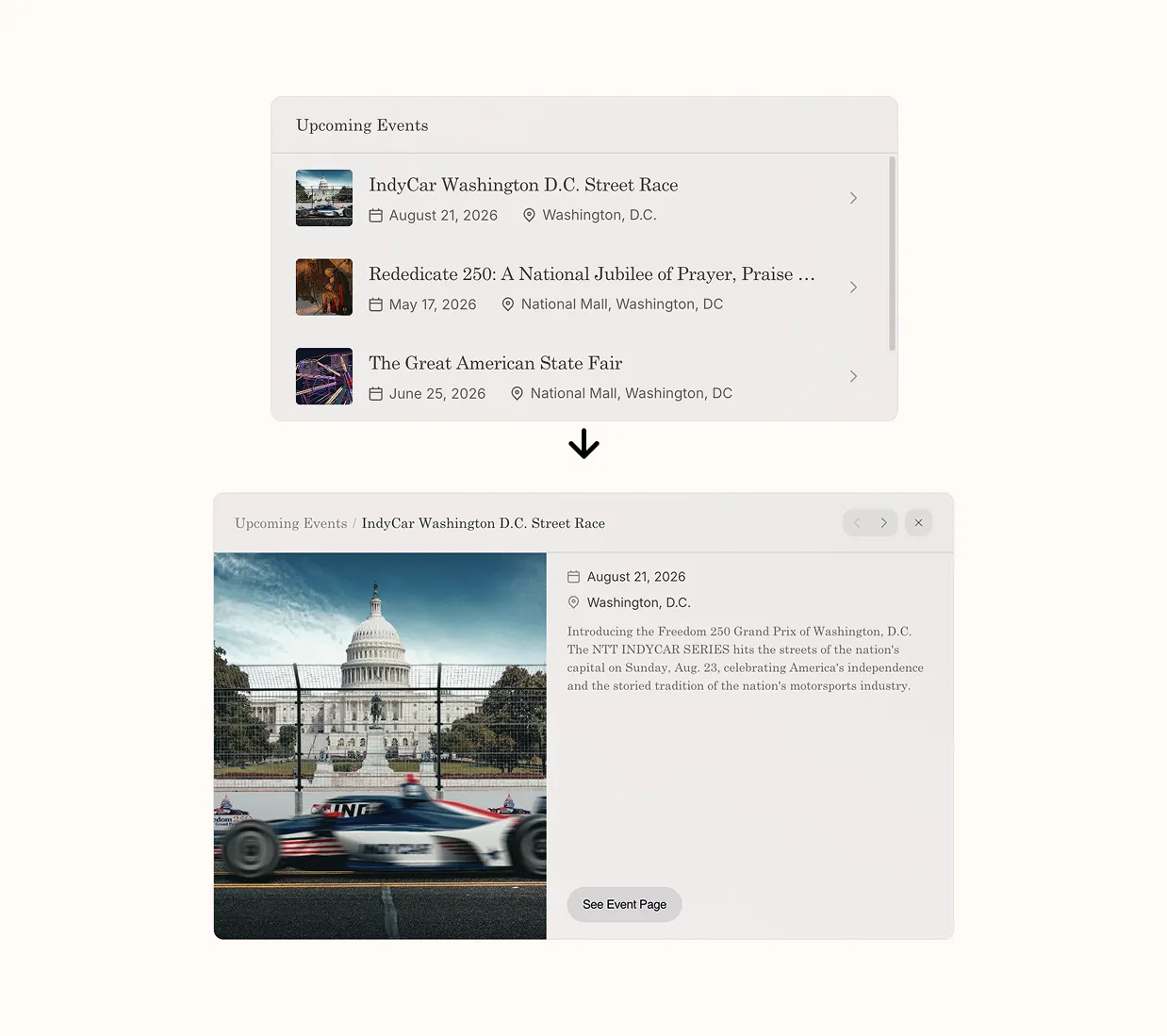
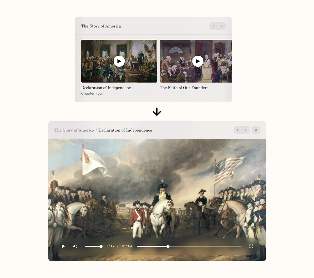
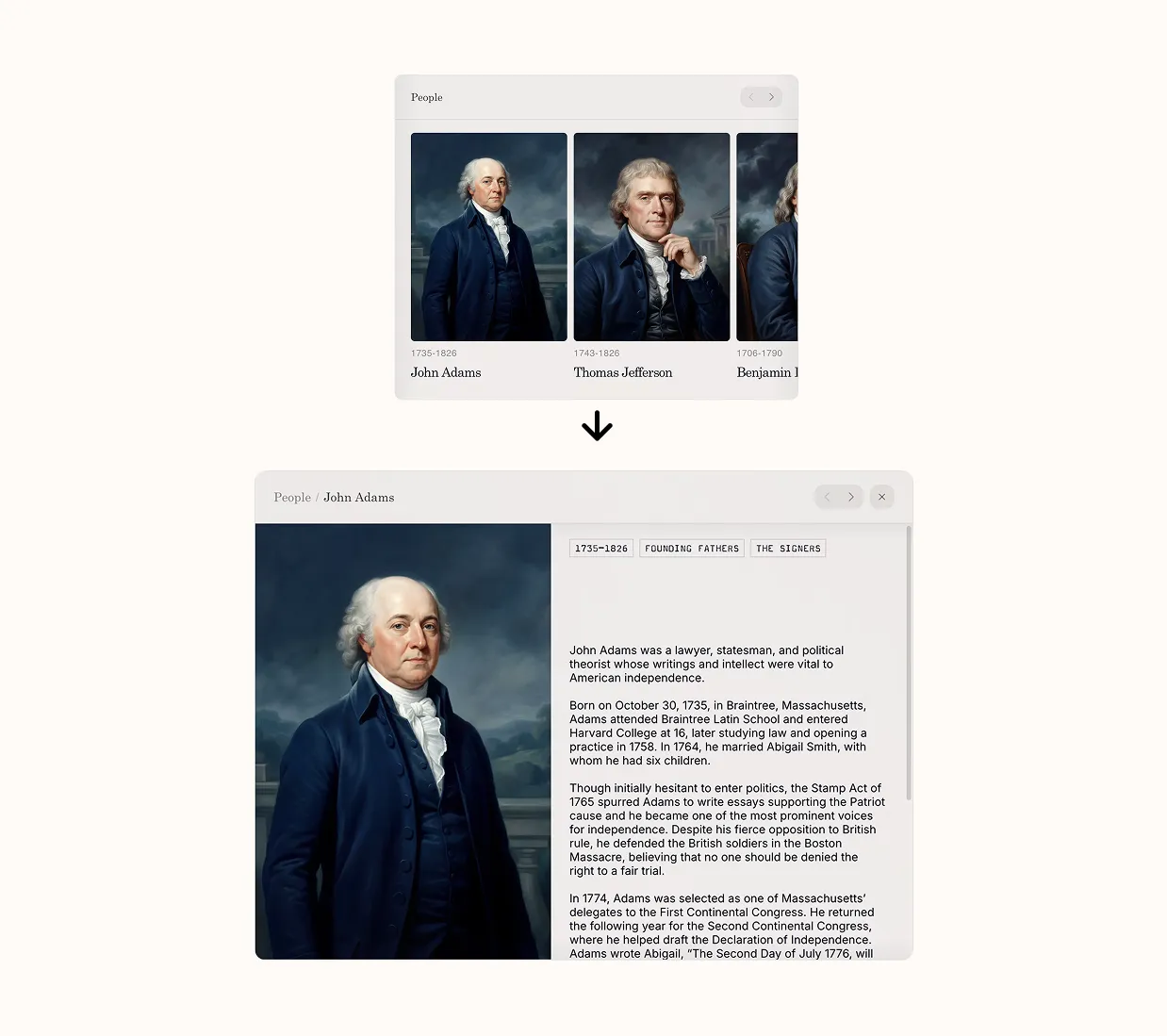
The third version adds one more piece: letting the cards open in place. Tap an event and the card expands with the details. Tap a Freedom Truck stop and you see what’s coming up. The page still exists if you want to go deeper, but it’s no longer required. That last bit turned out to matter more than we expected. It changed the assistant from a router into the place where things actually happen.
In hindsight, the issue in the earlier versions was the same: the assistant was still treated as something separate from the site. Once we treated it as the site’s primary interface, the design problem mostly solved itself.
Building Evals
Once the model was rendering UI instead of text, the question of whether it was “right” got slippery. The model could return a perfectly accurate answer and still surface the wrong thing first. The example that made this concrete for us: someone asks how to plan a trip to see the Freedom Truck. A good model, given that prompt, will produce a thoughtful itinerary. But what the user actually needs first is a map—they need to know where the truck is right now before any itinerary makes sense. The itinerary is correct and useless. The Freedom Truck map is what unblocks them.
This kept happening with different shapes. Ask how to host an event, and you’d get a list of events when what you actually needed was the form to submit your own. Ask about a city, and you’d get history when you wanted things to do this weekend. Nothing the model returned was wrong, just not optimized for the best experience.
For each kind of query, we wrote down what the right interaction should look like—which components appear, in what order, and what gets emphasized. Then we turned those into tests on a custom harness that checked the generated UI, tone, and text response.
We exposed the whole thing through a CLI, mostly because we wanted it to be cheap to run, and so we could let a coding agent drive the loop. It generates queries, runs them through the system, looks at what comes back, compares it to expectations, and when something’s off, it adds or refines a test case. We sit on top of that and make judgment calls when the agent is unsure, but most of the loop runs without us.
Making it hold up
This is a public-facing government site where the margin for visible failure is thin—and unlike many AI tools we didn’t want to run the risk of going viral on X for the wrong reasons.
The uncomfortable part of building on top of a model is that the model is not stable by default. It’s stable in the easy cases, like clean prompts and simple outputs. Rate limits, partial streams, and tool input/output failures can slip through the cracks when you’re processing thousands of conversations an hour.
A lot of the work, in retrospect, was less about making the model smarter and more about putting structure around it so it behaves consistently.
Guardrails. We didn’t want the model wandering outside what the site contains, or improvising on top of things that are already sensitive. In our testing, provider-level safety alone wasn’t tight enough for that. So we added our own guard layer in front of the generation. Every request gets classified twice by an open-source model from Meta before we pass it to our backend: once at temperature 0 (strictly literal), once at temperature 0.6 (higher variance). We only block if both passes agree.
The intuition there is that the deterministic pass catches the obvious cases and the stochastic pass catches the weird ones, and requiring agreement filters out the false positives that either one would produce alone. Without it you end up with the usual two failure modes: too strict, and the system rejects normal questions; too loose, and it answers things it shouldn’t. Blocked requests get a fixed response. We don’t ask the model to explain itself, because asking the model to explain itself is how you end up with a system that talks its way around its own constraints.
Fallbacks. Every request hits a primary model with a secondary on standby. When the primary fails in a way that looks recoverable, we cut over to the secondary and continue, then drift back to the primary after a delay. Streaming made this harder than expected, because errors don’t always show up before the response starts—sometimes the model gets two sentences in and dies. So we buffer the opening of every stream and only release it once we’re reasonably confident it’ll finish. If something fails early, we can switch models without the user ever seeing a half-formed sentence.
There’s a smaller failure mode that turns out to be more common than you’d think: the model returns successfully but produces nothing user-visible. This seems to be a model provider issue that appears semi-randomly. We’ve added test cases for it in evals, and for a real-time fix we’ll retry once with a stricter instruction that forces visible output. If that still fails, we serve a static message. It’s not elegant, but it’s better than the user sitting in front of nothing.
The SDK layer. Once you’re calling multiple tools, returning structured UI, and carrying context across turns, you start hitting cases where everything looks fine and still breaks. We ran into this most painfully with newer Gemini models, where certain combinations of tool calls and reasoning traces would silently drop part of what the model was doing. The request returned. The response looked normal. But a tool call that should have produced output just... didn’t, and there was nothing in the response to indicate it.
The cause was metadata that needed to persist across tool calls. The SDK wasn’t carrying enough state between turns for the model to know what it had already done. We contributed fixes upstream to the Vercel AI SDK to handle this, along with a few related cases around mixing different tool types in the same request. Small fixes, but the kind that matter disproportionately when you’re depending on behavior that isn’t fully settled yet.
Where we’re going
The thing that surprised us, building this, wasn’t the AI or even the interface—but rather the amount of “magic” you can feel in a design when you treat chat as a first-class interface. We also found that places where users genuinely need to browse are probably better served by traditional navigation. Not every interface should collapse into a query box.
But the lesson seems clear enough: bolting a chatbot onto a site doesn’t change the site. If AI is going to be useful, it has to change the interface itself.
That’s the part we care about, and we’re pushing on it across our work at National Design Studio, especially where the systems are hardest to use, which is most of where we work. If that’s the kind of problem you’d like to spend your time on, we’re hiring: ndstudio.gov/apply