February 27, 2026
Accessibility Matters
Edward Coristine
6 min read
National Design Studio is redefining accessibility in public technology—not as a compliance exercise, but as a core design responsibility. We start from the premise that if a system is confusing, it is inaccessible, no matter how many boxes it checks. Our work focuses on eliminating friction at the structural level: fewer steps, clearer language, tighter flows, and interfaces that respect the time, attention, and dignity of the people using them.
Accessibility means designing experiences so that people with and without disabilities can use them. National Design Studio designs its products for a nation – and that means delivering a delightful experience whether a user is using a screen reader, tapping on a cracked phone, rushing through on a lunch break, or anything in between.
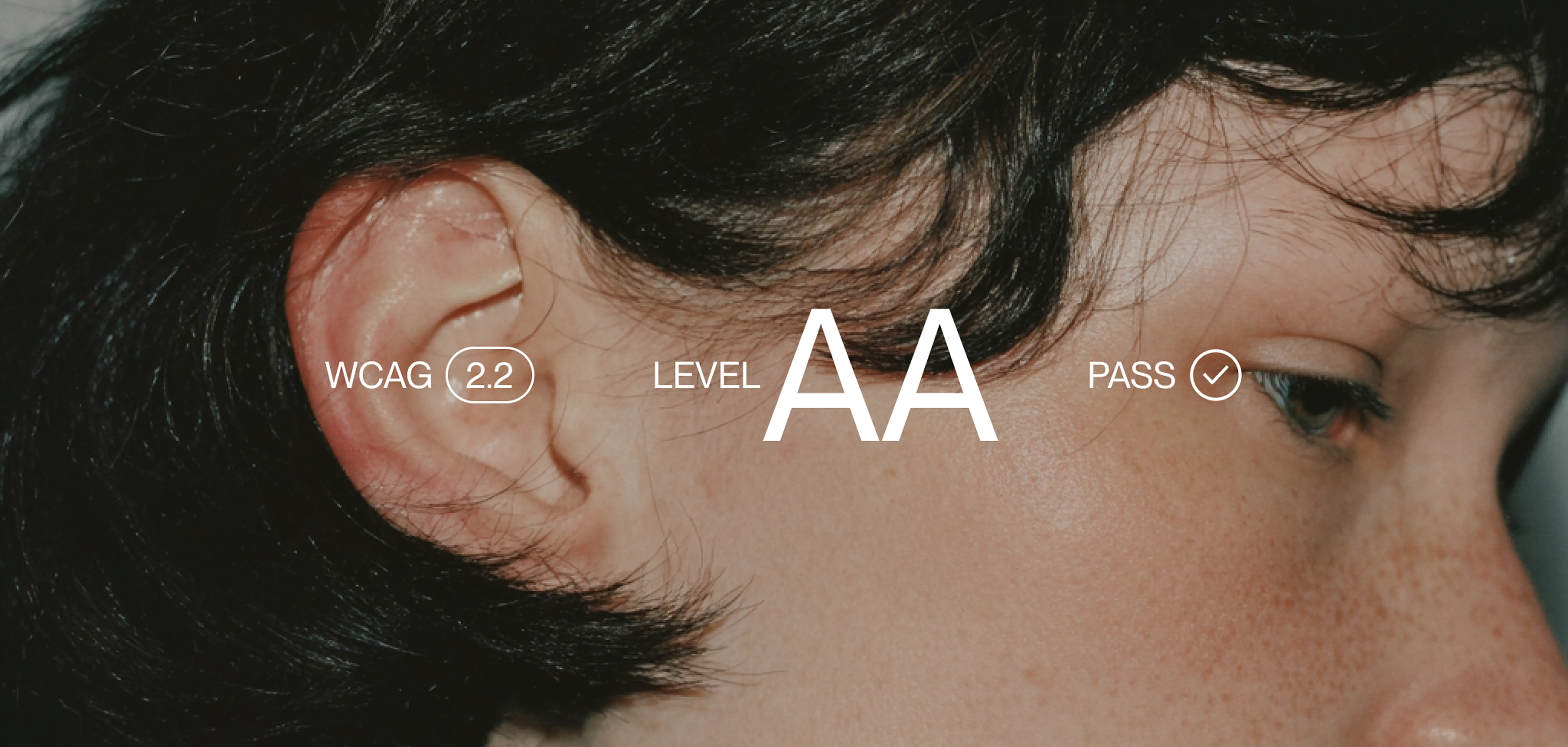
That starts with the non-negotiable baseline – WCAG 2.1 AA conformance, screen reader compatibility, semantic HTML, keyboard navigation, 4.5:1 to contrast or higher, and alt text on our assets. Respecting prefers-reduced-motion. These aren’t optional.
However, meeting the baseline is just the beginning of the conversation. A perfectly audited interface can still fail the person trying to use it. A senior citizen trying to access cheaper medication who can’t figure out what to click. A parent mid-flow who loses their progress on a form and doesn’t know how to get back. Someone who reads the same sentence three times and still doesn't know if they qualify.
For twenty years, the accessibility industry has focused on the downstream problems: contrast ratios, focus rings, screen reader compatibility. These matter. But they treat accessibility as a compliance problem to be audited rather than a design problem to be solved. A form that passes every automated check can still be functionally inaccessible to someone who can't figure out what it's asking. Reducing complexity is the primary accessibility feature and no automated tool catches it.
Bundled with industry standards, National Design Studio treats streamlined user experience as the entire accessibility discipline.
The most accessible interface is the simplest one
We start with a question: can someone who has never seen this before figure out what to do? Not a power user. Someone whose hands shake enough that a 12px checkbox is a wall. Someone who can't remember a password and gets a reset link that expires in five minutes. Someone who filled out the whole form, hits submit, but has no idea if it worked, and is too afraid to try again in case they do something wrong. Someone who drove to a government office and waited two hours because the website failed them.
As we formulate product this is the question that frames our thinking and our user research. Deleting unnecessary fields from a form is an accessibility improvement. Every piece of jargon replaced with plain language is an accessibility improvement. Every reduction in the number of steps between a user and their goal is an accessibility improvement. These are fundamental accessibility changes that benefit everyone. Truly complete accessibility enables a user to easily reach what they are trying to access in the first place, while saving time and maintaining dignity.
This is what we mean when we say we design for a nation.
TrumpRx
As an example of a recent product National Design Studio has launched, TrumpRx.gov gives Americans direct access to discounted prices on prescription drugs – savings as high as 93%. The population it serves is broad and, in many cases, vulnerable: people without insurance, people paying out of pocket for fertility drugs or GLP-1s, or people who fell through the gaps of an already complicated healthcare system.
When we started on this product, the activation experience had been designed by the pharmaceutical manufacturers themselves. The flows reflected internal compliance and risk management, but not user outcomes.
The result was predictable. Unnecessary and redundant data collection, layers upon layers of repeated disclaimers, and an unclear path to activate savings. In many cases, we were able to cut those flows substantially.
For example, with the popular weight-loss medication Ozempic, National Design Studio was able to work with the drug manufacturer Novo Nordisk to converge towards cash coupons, which makes it significantly easier to be able to activate the discount: you can now access it at any pharmacy instead of having to call your doctor and redirect your prescription to a speciality provider.
As another example, prior to our involvement, the FDA anti-kickback disclaimer had to be shown every time a coupon was rendered. It was paragraphs upon paragraphs of text that provided little value to the end user – for example, it disqualified people over the age of 65 from activating discounts under the presupposition that aged users wouldn’t be able to determine whether they are eligible for savings.
National Design Studio helped delete that. Now, for most products on TrumpRx, you can instantly get the savings card for the product – it’s right there when you open the page. No more redundant forms. No unnecessary clicks.
With each major iteration of the product, we brought a user testing group from an external firm, Code and Theory, to measure how well they were able to navigate the site and find their discounts. After National Design Studio changes were made, the firm reported that in “all audits, we found a significant improvement from last iteration. Users were excited about the idea and found the flow and experience more intuitive to navigate.“
From first principles, this is what accessible design actually looks like. Beyond readable text and keyboard navigation, accessibility is about being hardcore to delete every unnecessary bit of friction between the user and what they are trying to accomplish.
Join us
How easy it is for Americans to access government online services is important to us. With every iteration of product we launch, we improve. We respond to feedback rapidly and are constantly improving the products we’ve already launched.
If our approach to design is intriguing and you enjoy working on cleaning up convoluted user flows, shipping beautiful products, and going above and beyond typical accessibility standards, consider joining us.
Interested in contributing to this work? Join us